Sugaroo Sweets
Full Branding
Sugaroo is a cookie designer owned by Amanda Morris of Memphis, Tennessee. Custom creations, Amanda's cookies are the perfect (and adorable) dessert for parties, holidays and gifts!
Project Plan
Brand feels: Colorful, sprinkles and Australia-inspired.
Goal: Crafting a full brand suite for a "cookier" that reflects her colorful and creative style while achieving a timeless logo, useful imagery and supporting materials.
Project Materials
Logo Design
Inspired by a trip to Australia, Sugaroo takes its' whimsical name to a new level with a bright pink color and row of sprinkles. The rounded hand-lettered type is a unique take on the sanserif logo with a tight curl nested in the "S" and a large flourish from the "r" nesting the 'sweets' tagline and row of sprinkles.
The submark is a more direct homage to the Australian inspiration with a stylized icon of a kangaroo.
The Ellywise process of branding always begins with the logo. It's the main piece of branding that all future materials should reflect. The two most important keys to a successful logo is for it to be relevant and practical.
Photography
Content, content, content. All branding packages offer an addition of behind-the-scenes photography. It's the necessity that small businesses often have to go without. Showing your process, creations or even just a headshot of your lovely face can make the world of difference for your Instagram grid, Facebook content and content for your website.
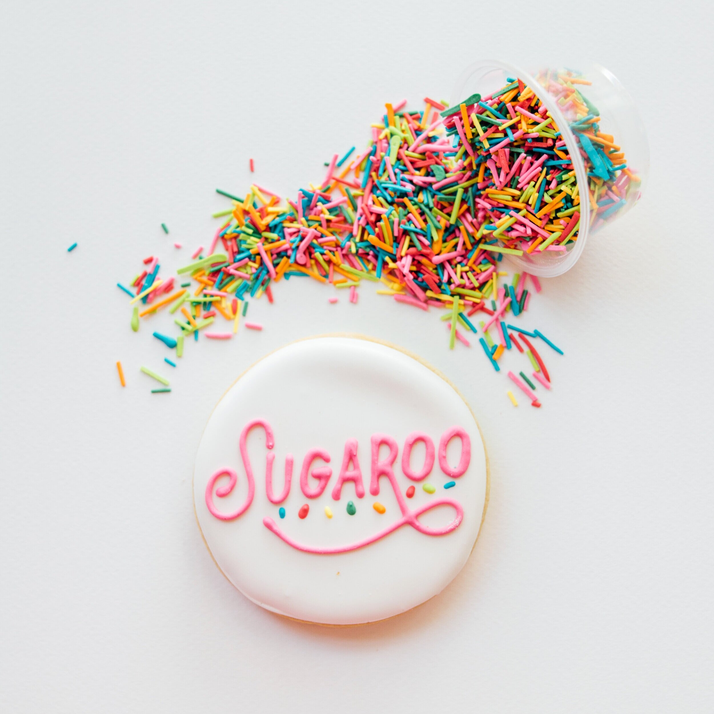
Sugaroo prepared branded cookies (LOVE!) and homemade sprinkles to match the new branded color swatches. A styled shoot with the branded items gave Amanda images to use for social media announcements of the new brand as well as content to use later on.
Supporting Materials
Cookie-specific needs, Sugaroo's postcard-sized inserts for cookie orders include ingredients list, allergies and other information necessary to the nature of the business. Sleek, square business cards were also included to use as needed.
Digital materials included all file types of the full logo suite as well as Instagram story covers, Facebook cover image and social media announcement imagery.


